Orientation Media Queries
Today I ran into a situation where I needed to use orientation media queries, which was a first! I’ve used many media queries based on screen width, but until today I had no idea that CSS3 includes specs on screen landscape or portrait orientation.
When building out designs that require different layouts on landscape/portrait tablet or mobile views (in my case, setting four images across the screen in landscape, and three across in portrait), it’s not hard to see why using media queries based on screen width is not the best idea.
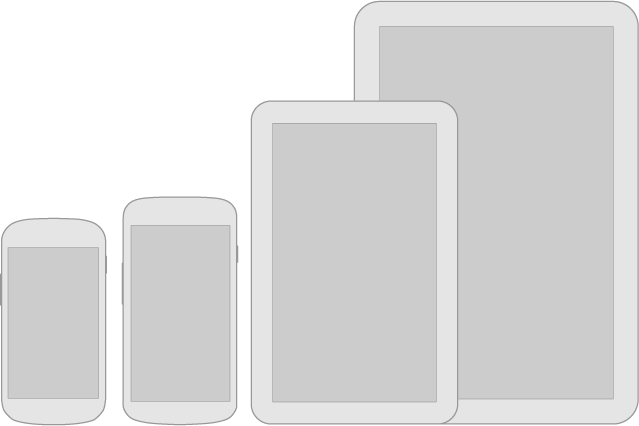
The pixel range that qualifies as portrait on a large tablet may qualify as landscape on a small tablet, and your designers could come after you in a huff for breaking their layouts. The line between the sizes of large phones, small tablets, large tablets, and small laptops is becoming increasingly blurry, and it seems like it’ll only become more so as more devices hit the market.
Orientation media queries offer a more foolproof solution — as noted on the W3 Docs, an orientation value is determined based on the relationship of the height and width of the viewport. If the height is greater than or equal to the width, the orientation is portrait, otherwise it is landscape. Here’s a basic example:
@media (orientation: portrait) {
	li {
		display: inline-block;
		width: 33%;
	}
}

@media (orientation: landscape) {
	li {
		display: inline-block;
		width: 25%;
	}
}
Here’s an example if you use Foundation & Sass:
ul {
	li {
		@media #{$portrait} {
			@include block-grid(3);
		}
		@media #{$landscape} {
			@include block-grid(4);
		}
	}
}
I’ve really come around to using media queries with Sass in Foundation. They’re super handy, especially if there are sizeable differences in the style of elements across mobile, tablet, & desktop, but you want to keep them close together in the file. Foundation’s docs on this are great!