Doing a Better Job at Web Accessibility

If you’re at all like me, this is what your experience is like when you first start learning about web accessibility:
- Check out your site on a screen reader
- Freak out at how bad it is
- Open 300 tabs and research all the things
- Take some steps to fix it
Last night I took a GDI class on the topic, taught by my friend LeeAnn, so all of this is fresh on my mind! In the class, LeeAnn provided a wealth of information about accessibility best practices, as well as an extensive list of tools to test and improve code for better accessibility.
A few key takeaways:
- Web Accessibility doesn't just mean accommodating blind or deaf users
- It means making sure everyone can use your site, including users with mental & physical disabilities, and users who can't afford up-to-date hardware
- It encourages you to question the necessity of bells and whistles in your design
- Experiencing a site via a screen reader and auditing for accessibility should be built into regular maintenance and QA
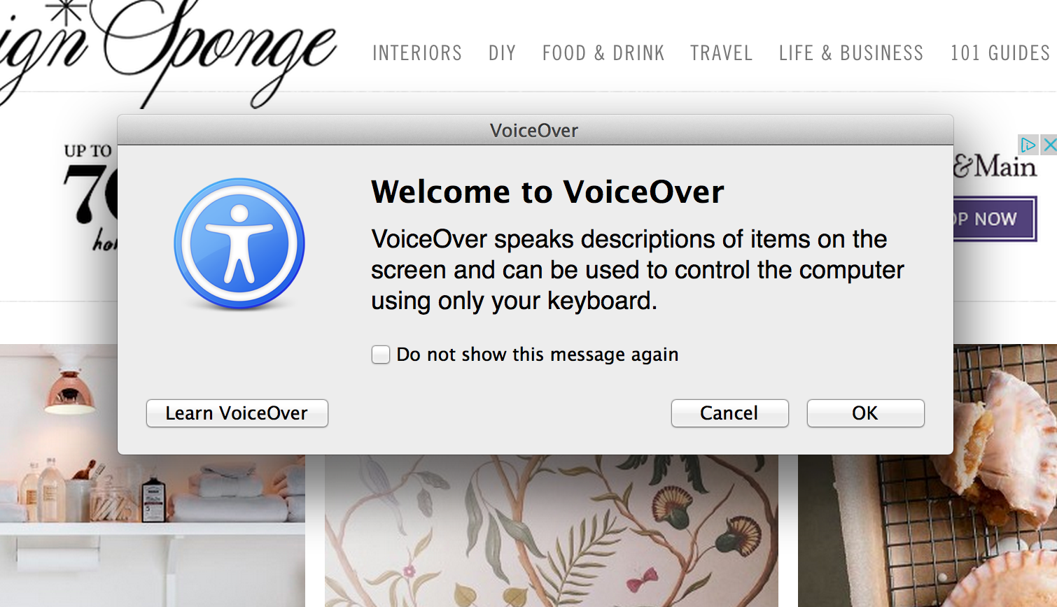
- The keyboard shortcut Command + F5 on a Mac will start the built-in osx Voice Over tool
- There are many free screen readers available for non-Mac users, such as this
- Writing semantic markup gets you lots of accessibility, basically for free
- Screen readers have context for each piece of content on the page, and can provide users with a better orientation about hierarchy
- Accessibility does impact the bottom line
- Obviously, no one will buy anything from a site they can't use
- Some countries (Canada & Australia) require accessibility by law, and some companies have been sued/fined for infringement
And a few things you can start using in your code right away:
Alt text for images is super important:
<img src="philadelphia-skyline.jpg" alt="Philadelphia skyline at sunset">Content that is hidden by the display: none CSS property does not get read by a screen reader. You can visually hide content but include it in screen readings by using this snippet:
.visuallyhidden {
    border: 0;
    clip: rect(0 0 0 0);
    height: 1px;
    margin: -1px;
    overflow: hidden;
    padding: 0;
    position: absolute;
    width: 1px;
}
Opening links in new tabs is disorienting for screen reader users; include a hidden span to indicate what’s happening:
<p>Here's a paragraph with a link to <a href='http://girldevelopit.com' target=
'_blank'>Girl Develop It<span class="visuallyhidden"> that opens in a new
window</span></a>.</p>
And a few really great resources:
In short, making accessible websites entails semantic development patterns and thoughtful designs, with neither of which you can really go wrong in the end. Another friend, Lisa, pointed me to this site when I was on an accessibility roll on Twitter after learning so much last night- it sums things up pretty nicely: http://motherfuckingwebsite.com/